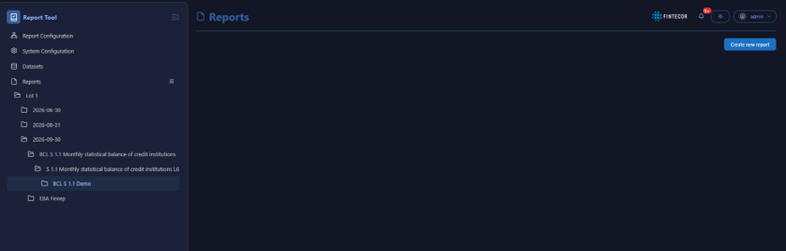
User Interface Management Overview
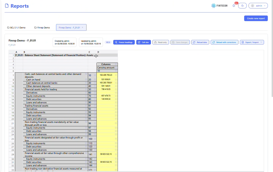
Context: Financial reporting workspace showing a specific regulatory template view (Finrep Demo - F_01.01 Balance Sheet Statement) with grid options and dataset management controls.
Key Components & Elements:
Top Action Trigger:
Create new report: Primary blue button in the upper right used to instantiate a new reporting set or template package.
Toolbar Action Controls:
Freeze headings: Pin/unpin row and column header labels so they remain visible while scrolling through large data tables.
Cell size: Adjust row heights, column widths, and grid density for optimal table alignment.
Read-only / Edit Toggle: Toggles the report between view-only mode and active editing state.
Save changes: Persists manual entries, updates, or overrides made within the report grid.
Reload data: Re-fetches current values directly from the backend dataset.
Reload with corrections: Re-populates grid values while applying the latest override rules and validation adjustments.
Export / Import: Dropdown menu to download the report (e.g., Excel/XBRL) or upload external data overrides.
Header & Shell Controls:
Theme Switcher: Crescent/sun icon in the top utility bar to switch between light and dark modes.
Context: Illustrates how workspace layouts can be adjusted to fit complex reporting tables.
-
Key Components & Elements:
-
Resize Handles / Grid Boundaries: Highlights interactive borders between columns and rows within the data grid.
-
Excel-Style Interaction: Accompanied by documentation noting that standard spreadsheet click-and-drag mouse gestures can be used to modify row heights and column widths dynamically.
-
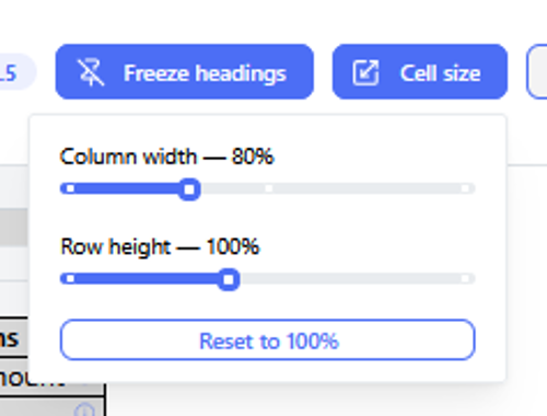
Context: Shows an expanded view of workspace layout controls and table parameter configuration options within the application interface.
Key Components & Elements:
View Controls: Highlights interactive elements for managing workspace density and element positioning.
Data Display Area: Demonstrates how data fields adapt to modified grid dimensions and custom layout structures.
Context: Focuses on user preference controls located in the application header.
-
Key Components & Elements:
-
Theme Switcher: Displays the upper right-hand corner control button used to toggle between light and dark visual themes.
-
UI Header Area: Illustrates the surrounding status icons and user profile indicators in the top navigation bar.
-